Archives search: between "Christ will conquer" and the off-center cross

ugc1891_html_m49241d7fWhen the new UUA logo came out recently, quite a few people (myself included) japed about it on Facebook and mused about the past logos, some quite old. I noted the Universalist “Christ Will Conquer” seal and the off-center cross.

Here's a "Christ Will Conquer" use from 1920
Here’s a “Christ Will Conquer” use from 1920

But dang if, in my research at Harvard-Andover Theological Library, I didn’t find a missing link graphically between the two. It should be noted that I have found no official adoption for any of these logos, but it’s not the sort of thing that’s voted upon, so I suppose the most we’re ever likely to find (if anyone looks) is a launch notice, and probably not even that. We live in a branded age today, and I suspect these earlier “logos” were originally corporate seals (as we’ll see evidence below) that later took on an “inked” existance, much as the flaming chalice started on letterhead.

So let me introduce the “All Conquering Love” seal.
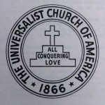
all-conquering-loveI’m guessing that it did not predate 1935, when the Washington Avowal was adopted by the Universalist General Convention (UGC) at the still-swank Mayflower Hotel, a short walk from my day job office and a lovely place for drinks.

The version of the image here is from the cover of the 1946 edition of the Laws of Fellowship, and in this context I wonder if its release was associated with the UGC’s 1942/43 re-conception as the Universalist Church of America.

The whole Washington Declaration text is a historical layer cake, and its use was to define the terms of fellowship between the General Convention, the state conventions, the churches and parishes and the members of the ministerial college. The Avowal is its core, with the text in bold type being the part best remembered:

The bond of fellowship in this Convention (church) shall be a common purpose to do the will of God as Jesus revealed it and to co-operate in establishing the kingdom for which he lived and died.

To that end, we avow our faith in God as Eternal and All-conquering Love, in the spiritual leadership of Jesus, in the supreme worth of every human personality, in the authority of truth known or to be known, and in the power of men of good-will and sacrificial spirit to overcome evil and progressively establish the Kingdom of God. Neither this nor any other statement shall be imposed as a creedal test, provided that the faith thus indicated be professed.

And while you can draw a straight line from “the supreme worth of every human personality” through “to affirm, defend and promote the supreme worth of every human personality” (from the 1961 Principles) to “inherent worth and dignity of every person” I think that image of God being Eternal and All-conquering Love is far more evocative, even thrilling.
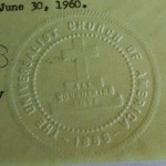
all-conquering-love_seal_1960Back to the idea that it was a seal: well, I found two cases (1958 and 1960) of the UCA corporate seal with this design, the rings simplified. Here is the easier-to-read 1960 version: a level of officialdom the off-center cross could not claim. (I did see it on the letterhead of the Illinois state convention; Clinton Lee Scott’s influence from his Peoria pastorate?)

Archives search: rescued from the wastepaper basket

This is the first part of a (surely long and rambling) series on findings from Universalist records at Harvard Divinity School’s library archives.  My thanks to Fran O’Donnell and Jessica Suarez of the Andover-Harvard Theological Library for making my visit possible. I love combing through these Hollinger boxes. Evidence of Yankee thrift abounds. Serious business — which today would be shipped by courier or with tracking numbers, or protected with encryption — went by typed postcard. But one of their habits — one I share — revealed some glorious relics. Make old print jobs into scrap paper; the other side has a use you know. So mundane memos preserve scraps of design choices. Here are a couple I caught.

Another Providence meeting

2014-03-17 12.09.19

2014-03-17 12.07.022014-03-17 12.12.32

Public-domain off-center cross

With due respect to the designer of the off-center cross here, this one — with thinner lines and a smaller cross; I made it about as high as the circle radius — looks more like the ones I’ve seen used by mid-century post-Christian Universalists. Its later, and I think unintentionally ironic, adoption by Christians notwithstanding.

For Universalist Christianity, I’d suggest an anchor or heralding angel as more appropriate, but that’s for later.

In the spirit of the original, I also dedicate these graphic files to the public domain.

The public domain declaration applies to the ready-to-use PNG and the better-for-making-derivative works SVG, downloadable below.

Off-center cross emblem


CC0

To the extent possible under law, Scott Wells has waived all copyright and related or neighboring rights to off-center-cross_thinner-10px_cross-radius_300px.png. This work is published from: United States.


CC0

To the extent possible under law, Scott Wells has waived all copyright and related or neighboring rights to off-center-cross_thinner-10px_cross-radius.svg. This work is published from: United States.

Observations from the Unitarian Universalist website scan

Some notes from my quick survey of Unitarian Universalist websites. This speak to the broad middle in quality; I’ll be writing about the really amazing ones and some deeply problematic habits another time.

  • Unitarian Universalists sites make little use of web fonts, which is unfortunate as Google makes many families available free of charge. (This blog uses two.) Noteworthy exceptions:
  • And yet much too much Papyrus.
  • Congregation size (or influential pastor) is no guarantee of a high-quality site; some very small congregations punch above their weight (or some other sports metaphor.)
  • Unitarian Universalist sites are prone to be wordy — a shocker, right? — and many seem to value long lists of service and newsletter archives. On the front page. Why?
  • Many sites are not suited for mobile devices; I’ll keep harping on that one.
  • Lots of sites independently designed, I’m guessing locally; most of these are reasonably well designed.
  • There was an obvious shared effort in collaborative web development in past; will try to track down the initiators.
  • The “off center cross” appears on three Unitarian Universalist sites, all of Universalist origin:
  • Also, more use of the 2005 “flytrap chalice” than I would have guessed.
  • Lots of Weebly sites. Also some WordPress.com ones, but fewer Google sites that I would have anticipated. All, at a basic level, are free of charge.
  • Saw some Drupal installs — which will power the new UUA.org site — even for churches too small to make the best use of it. Surely hobbiest interest; been there myself — and turned back.
  • Installation photos seem to be a thing as a front page image.
  • Massachusetts sites tend to feature the prominant meeting-house photo, and also tend to be better designed overall. Those areas with fewer Unitarian Universalists, in my impression, have poorer sites overall. That deserves a rescan.
  • Mozilla style guide inspiring to read

    With all the recent talk about the new Unitarian Universalist Association visual standard, it was a pleasure to run across another way of approaching the task. Mozilla, who produces the popular Firefox browser, has its entire style guide available for review on its website. You can also download its open-source standard font, Open Sans. It’s full of interesting design choices, and it just makes me feel better about Firefox.

    The whole suite might inspire a design-forward congregation to adopt similar parts of a standard for its own branding. A cmmon font free to share would be a plus, and congregations would also benefit from templates for often-used documents.

    Double circle symbol for you to use

    OK, the flaming nectarine was a bit of fun, but here’s something that might be more useful. The linked, double circles are an older emblem of the Unitarian and Universalist consolidation, and deserve some attention, at least in “communion of the churches” settings. It uses the gradient standard of the new UUA visual identity.

    Double ring logo, CC-BY Scott Wells

    You are welcome to use, modify and share this symbol, even commercially, provided you acknowledge me. This licence applies to the ready-to-use PNG and the better-for-making-derivative works SVG, downloadable below.

    You may acknowledge me in words or by a link back to this particular post.

    If in words, and because it is a small symbol, the acknowledgment may be inconspicuous, on a colophon or acknowledgements page, or in an alt tag.

    Please use this form: CC-BY Scott Wells

    Creative Commons License
    Double ring symbol by Scott Wells is licensed under a Creative Commons Attribution 4.0 International License.
    Based on a work at http://boyinthebands.com/wp-content/uploads/2014/02/dual-rings_gradient.png.

    Creative Commons License
    Double ring symbol by Scott Wells is licensed under a Creative Commons Attribution 4.0 International License.
    Based on a work at http://boyinthebands.com/wp-content/uploads/2014/02/dual-rings_gradient.svg.

    This blog in five themes, on my phone

    So, continuing the thread about the “twenties” default WordPress themes, I thought I’d see what this blog would look like in an untouched version, Twenty Ten to Twenty Fourteen. (I’ve already tweeked Twenty Thirteen for this blog, and while I adore each of you, I’m not reverting it for this blog post.)

    I chose this blog so I wouldn’t be thought to be picking on (or praising) a particular congregation. Will pick up on what this may mean later.

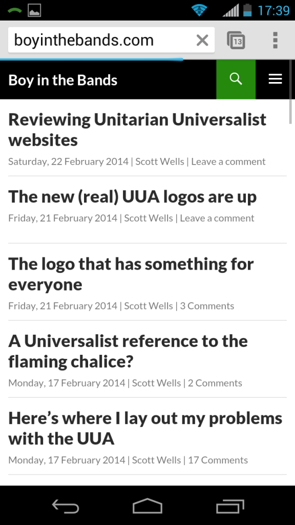
    2014-02-22 17.39.08
    Mobile view of this blog in Twenty Fourteen
    2014-02-22 17.38.36
    This blog in Twenty Twelve


    2014-02-22 17.37.41
    This blog in Twenty Eleven


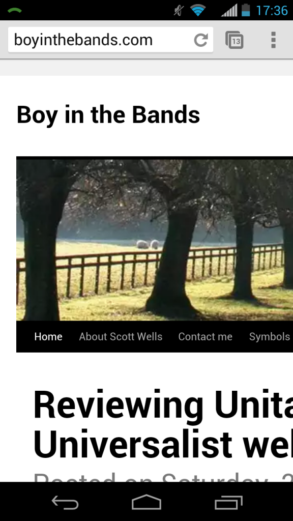
    2014-02-22 17.36.46
    This blog in Twenty Ten, as it loaded
    2014-02-22 17.36.39
    This blog in Twenty Ten, pinched to make it readable
    2014-02-22 13.24.56
    The Twenty Thirteen theme, with some text sizing modifications

    Reviewing Unitarian Universalist websites

    For the last three days, I’ve made quick-and-dirty survey of all Unitarian Universalist congregational websites. Most are acceptable, if improvable. Some very good. But too many are homely, underpowered or just plain ugly. About 18 are down or broken, at least right now. Two or three have let their domains expire. And some congregations have no web presence at all. And what about mobile devices?

    As I go through the hundreds of websites — getting an impression of the front pages — I’m sorting some of them into the following categories:

    • The very basic (though not necessarily bad)
    • The shockingly ugly (though perhaps technologically serviceable)
    • Those which use very slightly altered WordPress default templates
    • Lost or non-loading sites

    In addition I’ve been taking notes; I’ve found three examples of the new UUA logo already in use, in case anyone was curious. One. Two. Three.

    Without embarrassing any particular congregation (but I might praise a couple) I’ll report on what I found later. An actionable step away our too-common culture of shabbiness.